
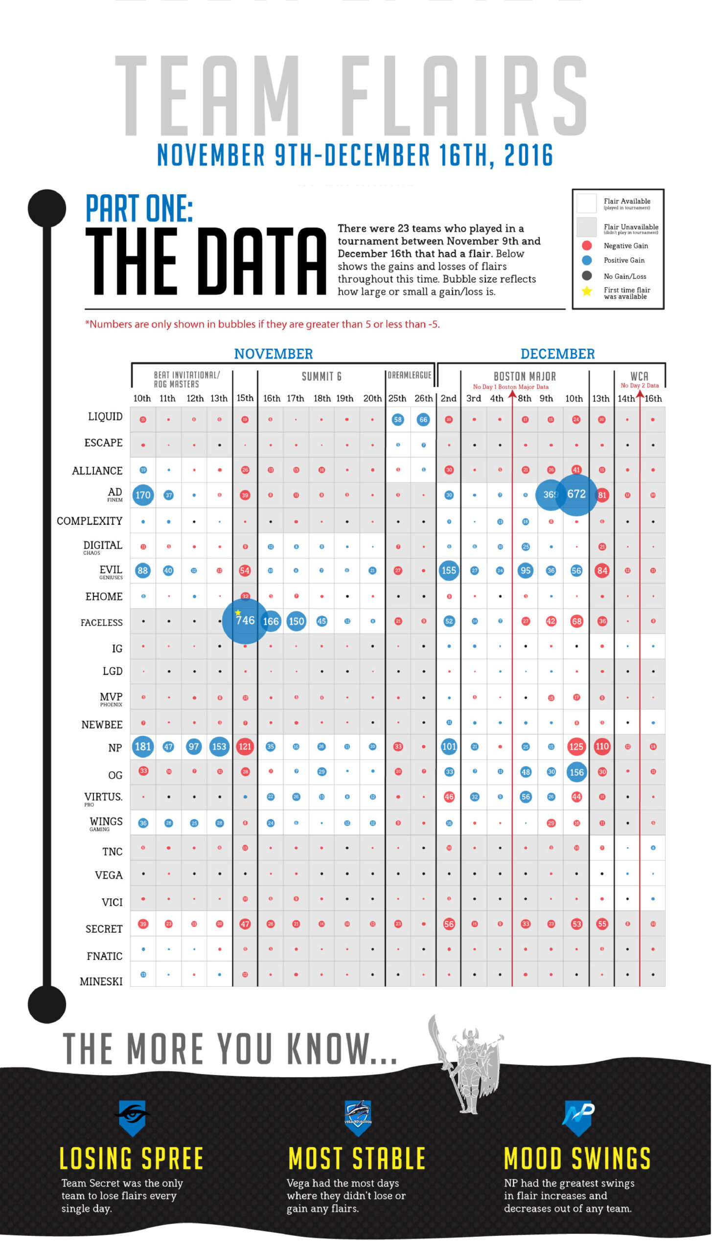
Team Flairs Infographic
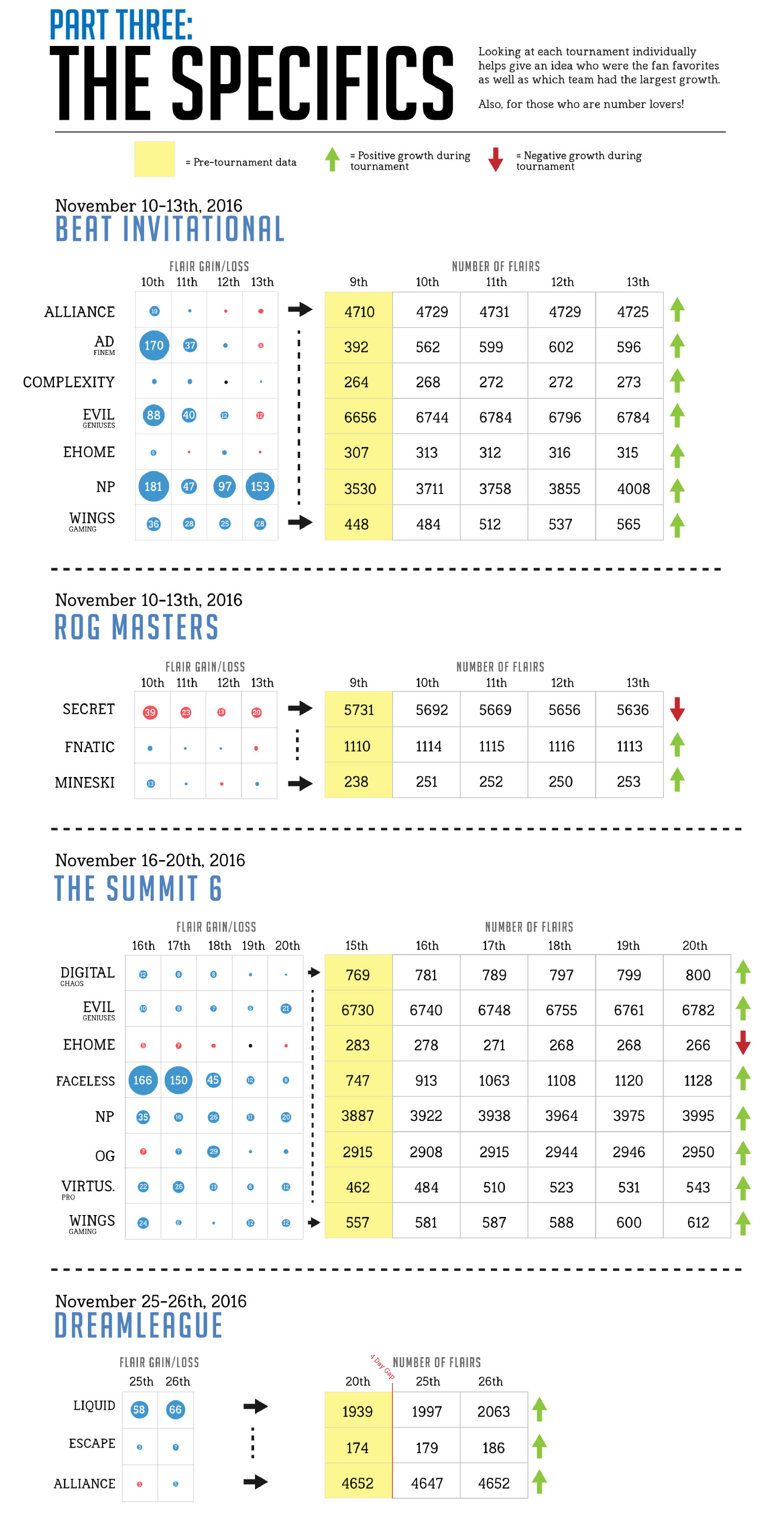
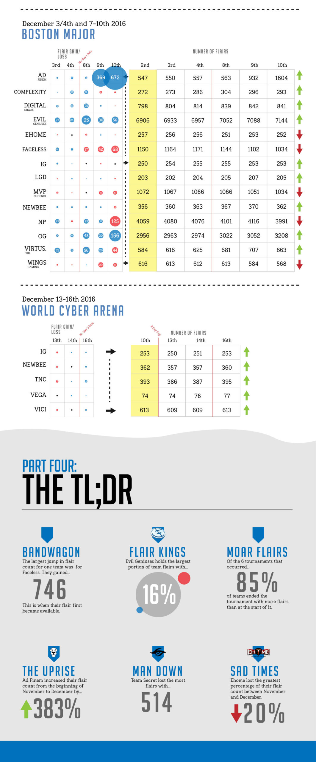
I was approached to design an infographic displaying how users on the website Reddit (Dota 2 subreddit specifically) changed their flairs to different esports organizations during a 1 month period of time. This time frame also included data from a tournament where a relatively unknown team, Ad Finem, went on to finals in the Boston Major and the amount of fan support they gained.
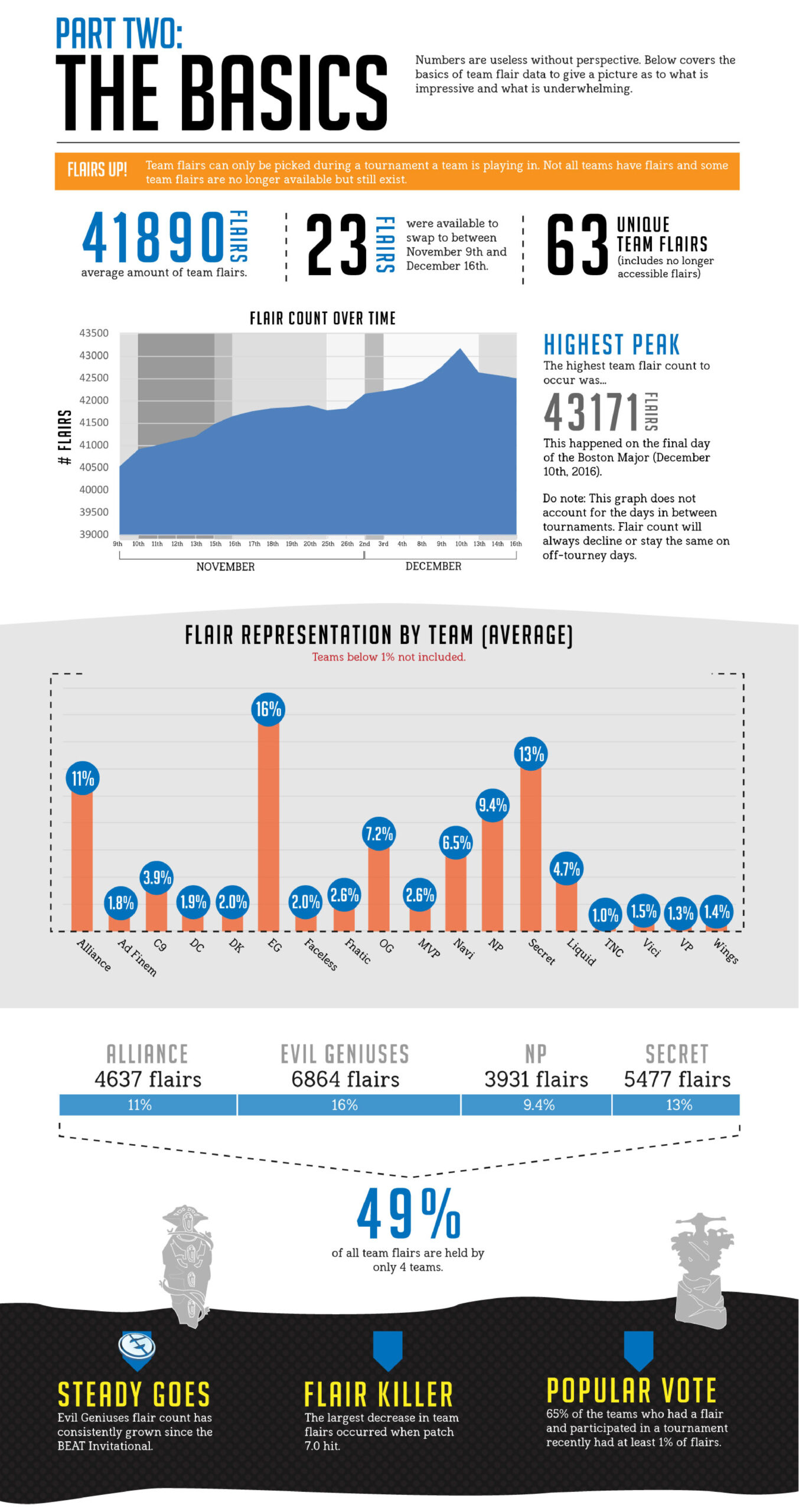
I love creating infographics and giving data a fun spin. I laid the information out in a few different ways: visual representation of gains and losses in a bubble chart to allow readers to see at a glance where the largest swings in data occurred between the teams. I also laid the data out with the exact numbers shifts to allows those who prefer to think with numbers a chance to review the data. In addition to this, I included little snippets of stats that were particularly fun or interesting in case the reader just wanted something quick to look at.