This is concept artwork. The name of the brand has been altered.
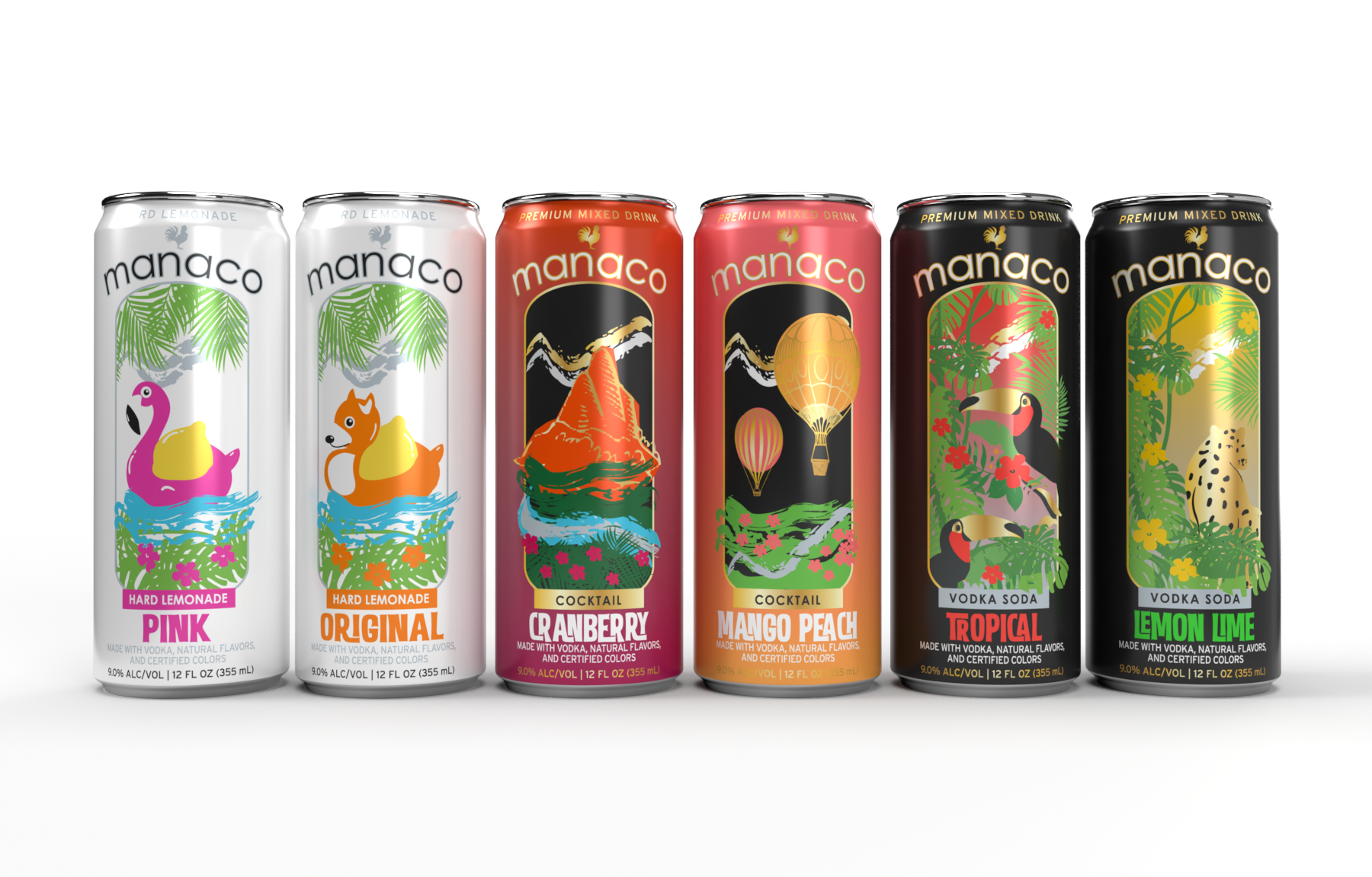
Manaco
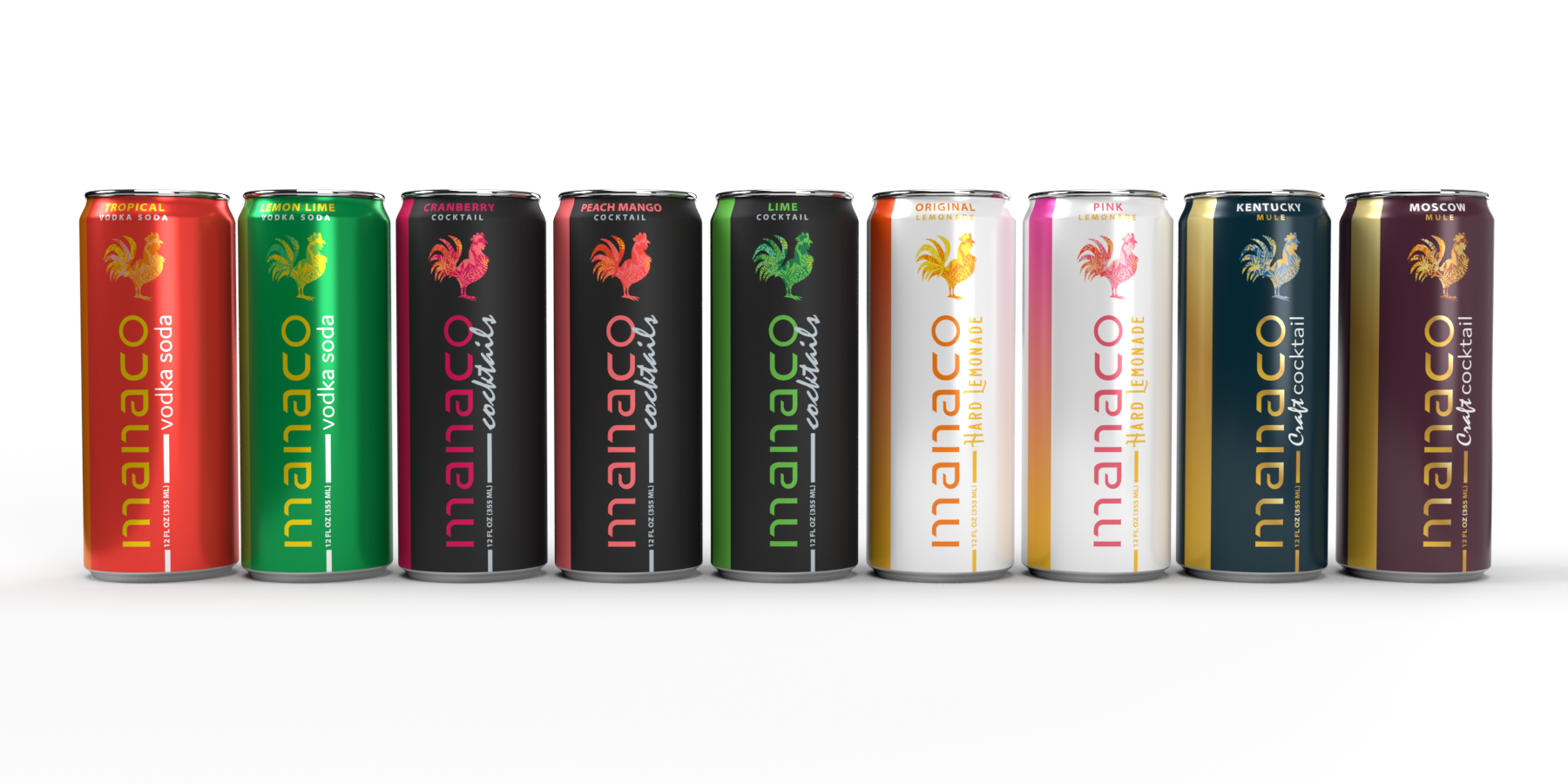
OBJECTIVE: Design artwork for a new line of hard lemonades and update existing cocktails, vodka sodas, and craft cocktails to a new, cohesive look.
Additional Information
The rooster is a main brand icon and was requested to be on all ideas.
With a background in can prepress, I designed layouts that meet can limitations so the final product would print as previewed.
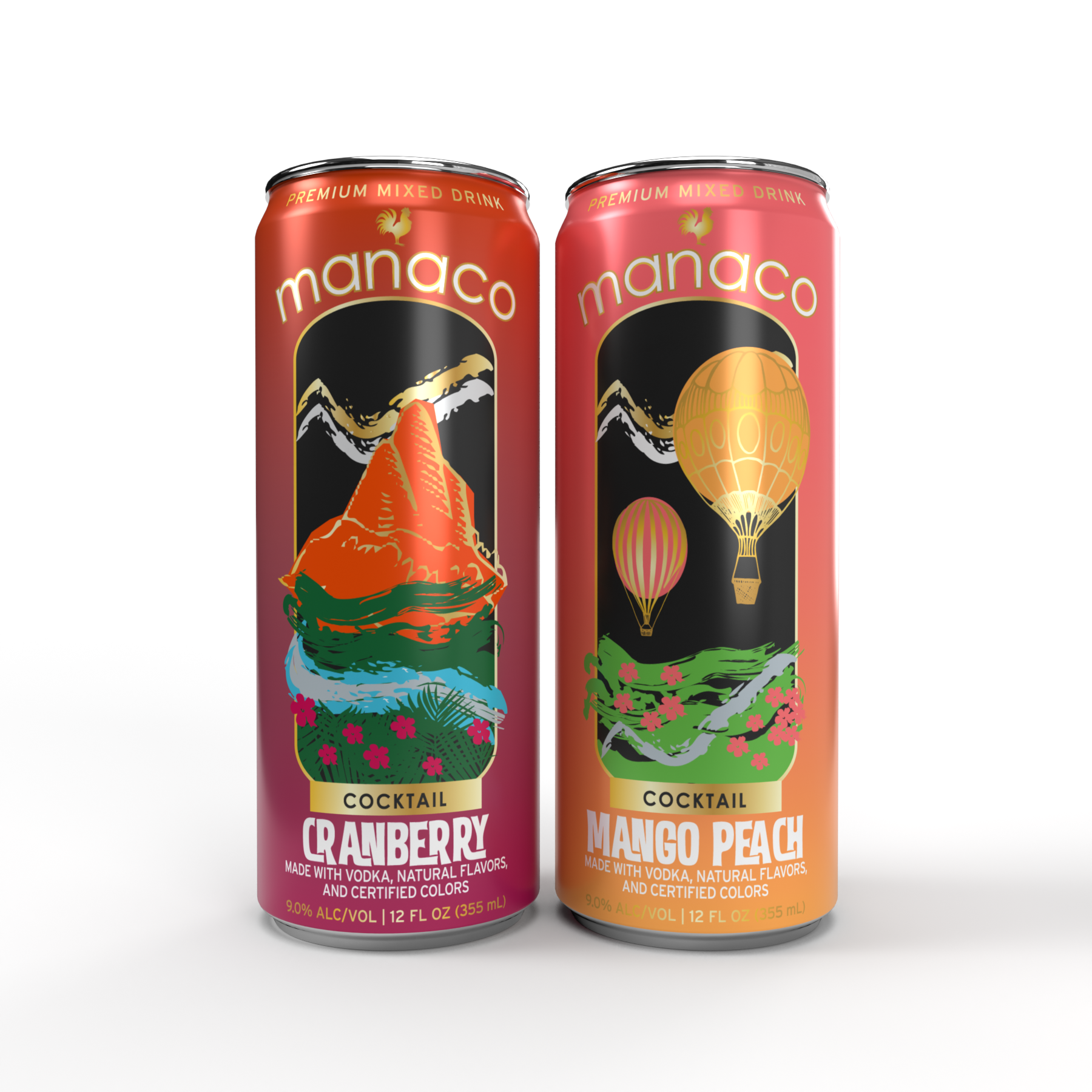
After doing some brain storming, I landed on the idea of “living the good life”/”Oh, all the places you’ll go” (The Dr.Seus book!). This served as the base for my ideas as I imagined what or where would consumers go to live the good life with Manaco by their side.
For the cocktail line, I wanted each flavor to represent an activity or location that people may have on their bucket list for what they would want to see or experience. I wanted to keep each location/activity nondescript so the drinkers of Manaco could fill in the specifics themselves! (ie, Balloon festivals can be found across the country, I didn’t want to reference to one in specific to make other experiences less special).
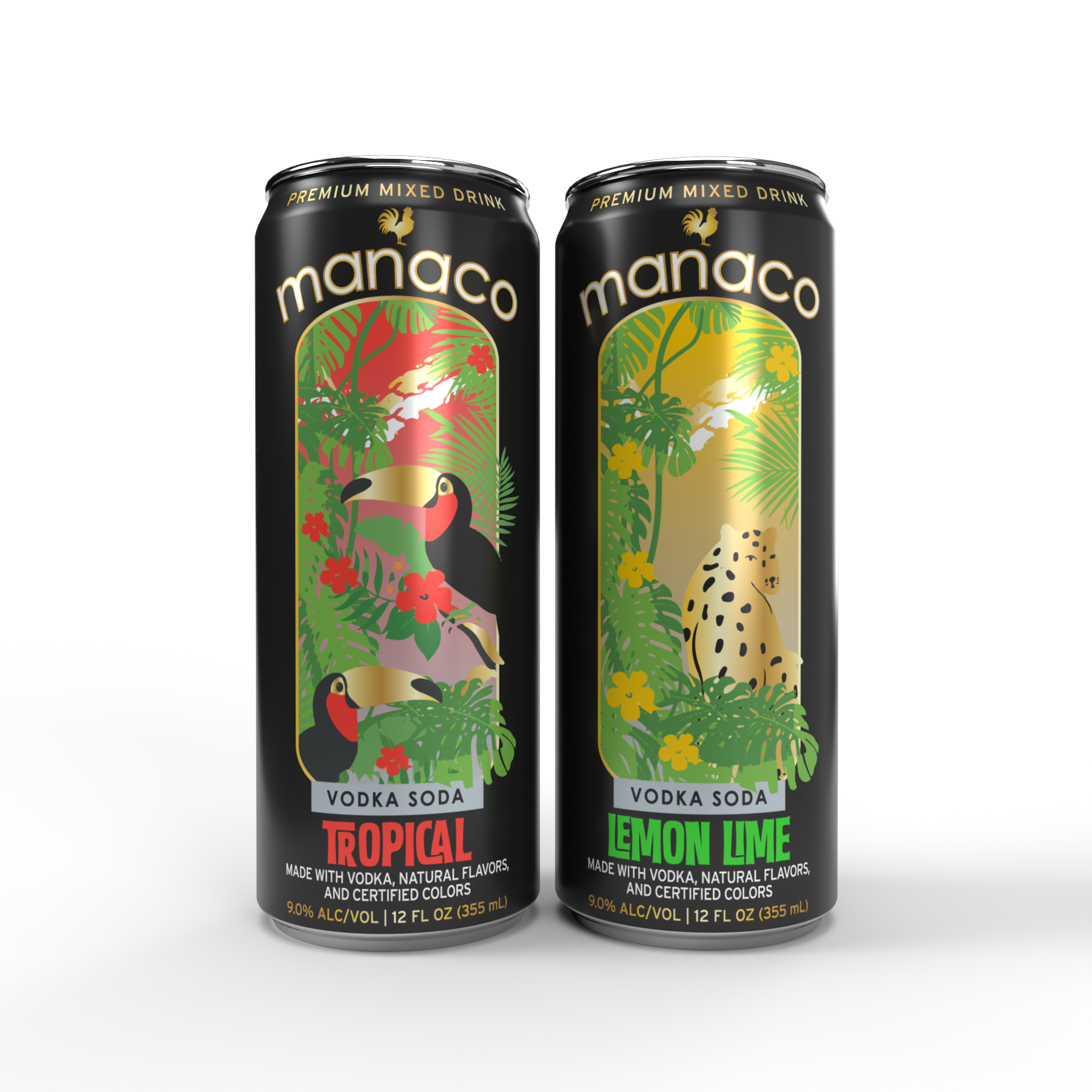
For both Lemon Lime and Tropical Vodka Sodas, I wanted to touch base more on the beauty of the world instead of the beauty of experiences like for the cocktail line. The one place that came to mind is the rainforest. It is one of the most diverse and breath taking places in the world and seemed like the perfect fit for what I envisioned for this line.
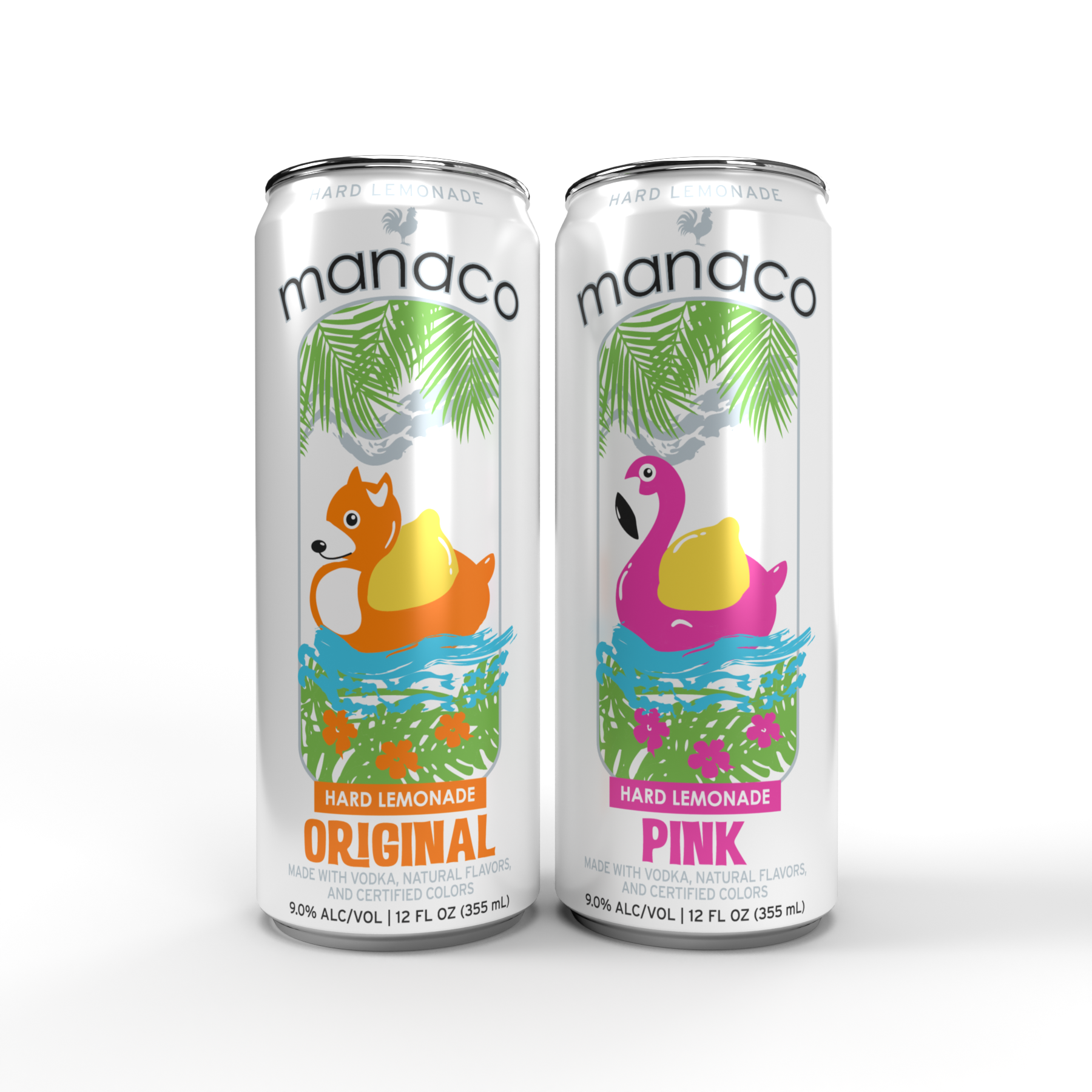
When designing the Hard Lemonade line, I wanted to focus more on the simpler things in life: having fun and tubing with friends.
All flavors have hints of gold and silver on them to give them a sophisticated look.
Client
Manaco (renamed)Year
Fall 2020Designed at Advertising Art Studios
Additional Ideas
Idea presented as an additional direction that was more in line with what is currently in the market but with a new look.
The non-altered name of the product references a place that is paradise/tropical in nature and I wanted to play off of that idea for their new look. I incorporated palm trees, flowers, and general greenery inside the shape of the rooster.
For their cocktail line, I designed the cans to have a matte varnish to give almost a chalkboard like look and to really make the name of the brand pop with the flavor color. I also intended for the 2 sodas to use metallic ink so they would be incredibly shiny on the shelf next to the other Manaco products.