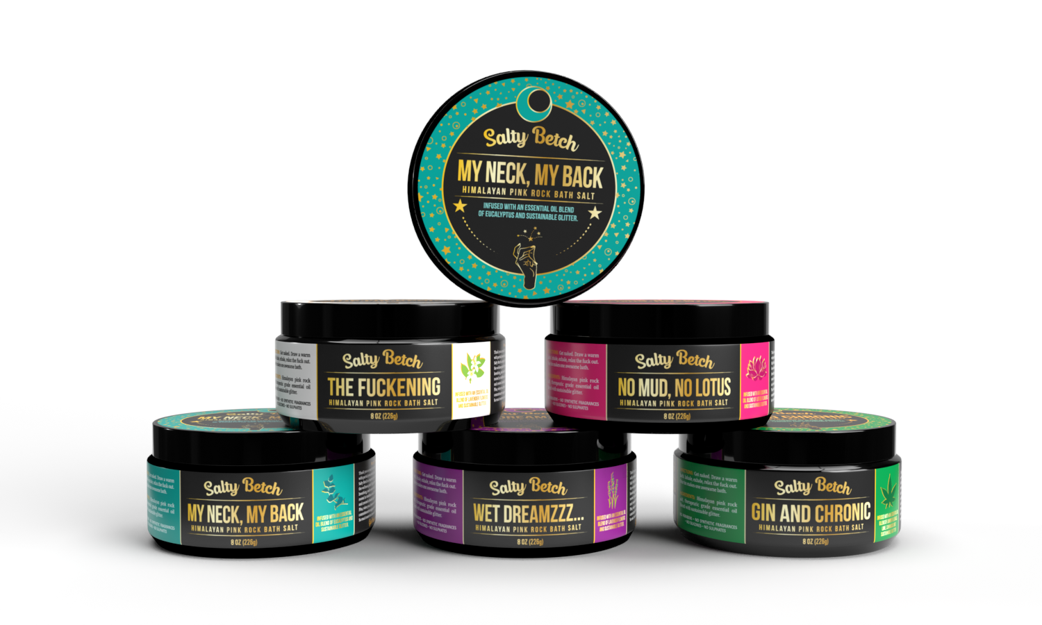
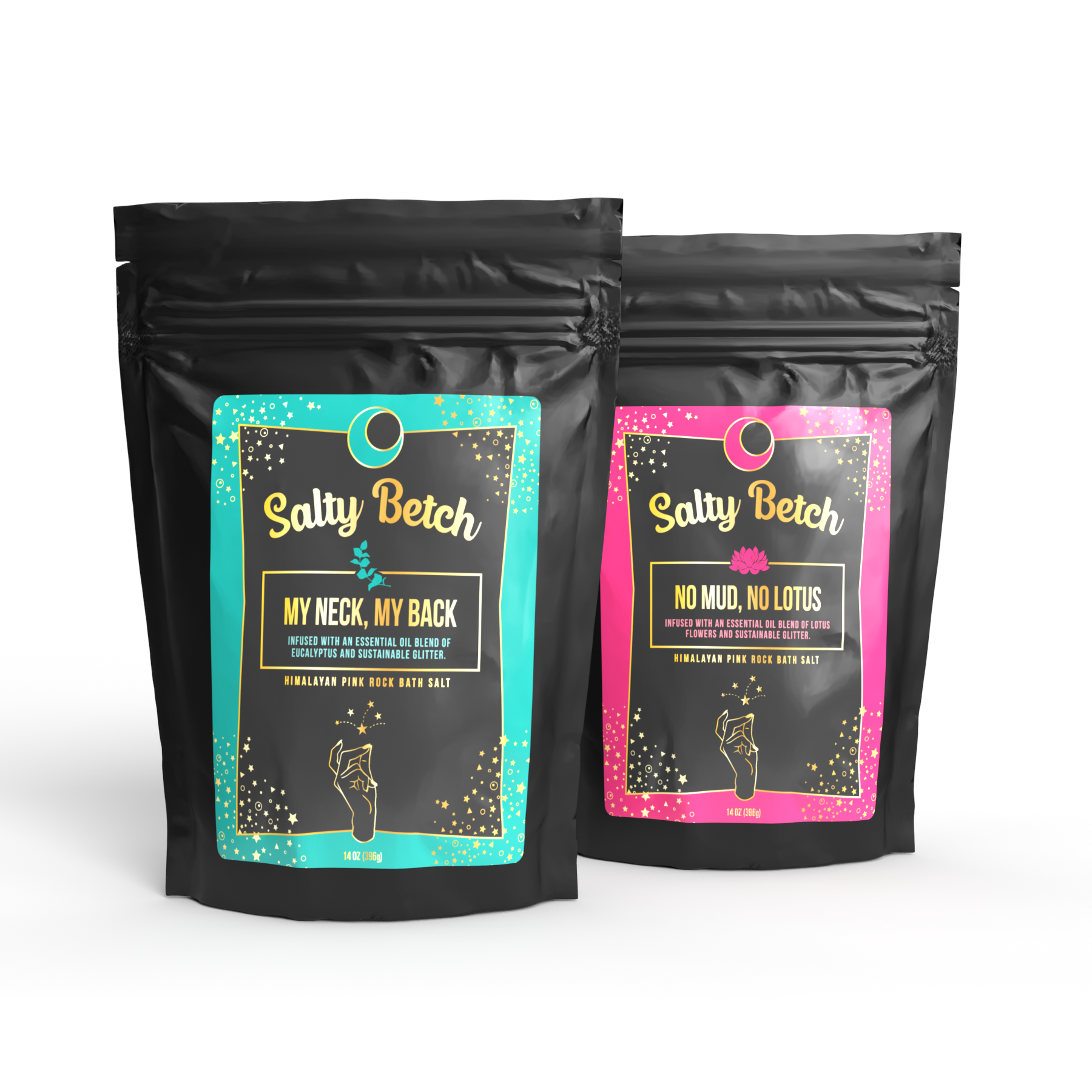
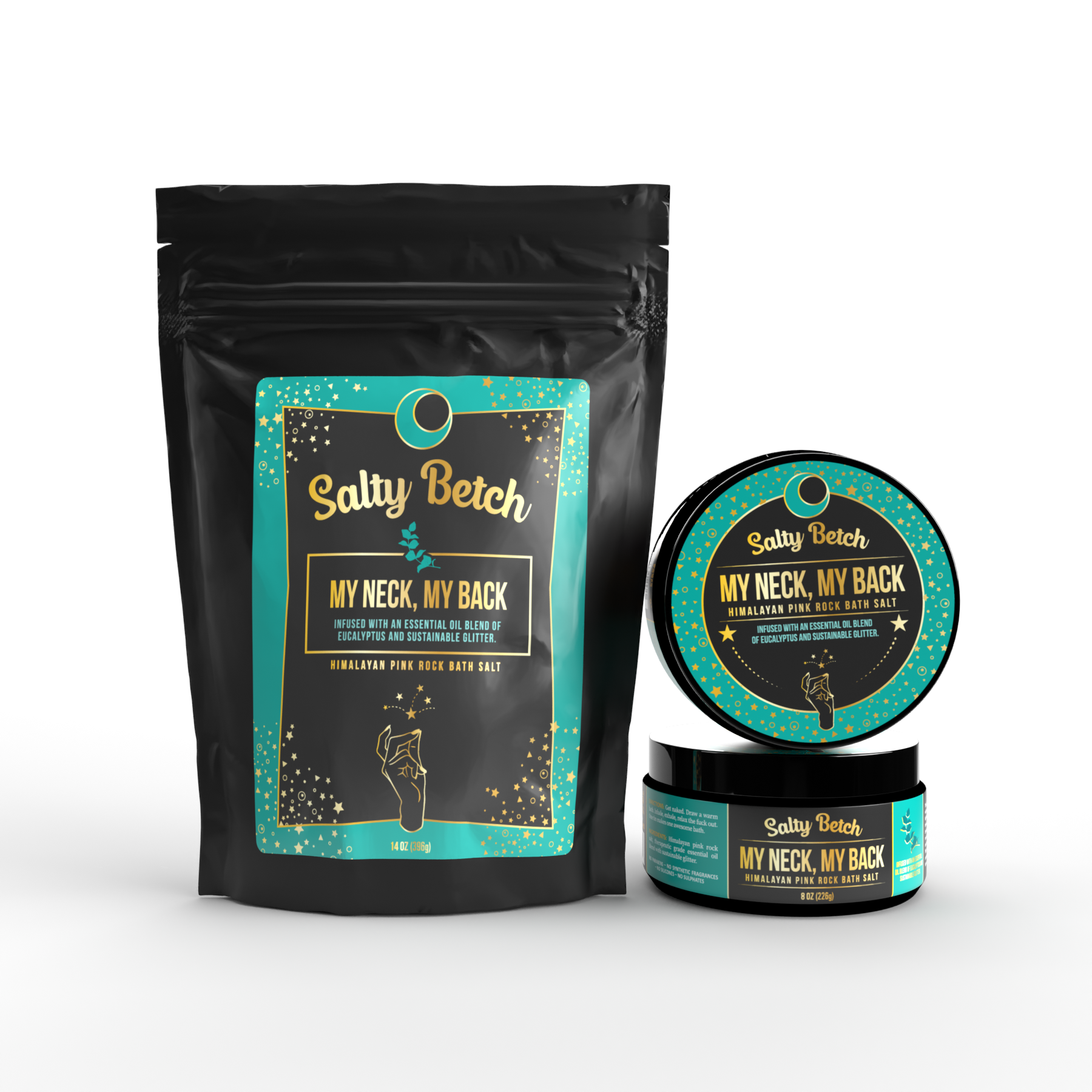
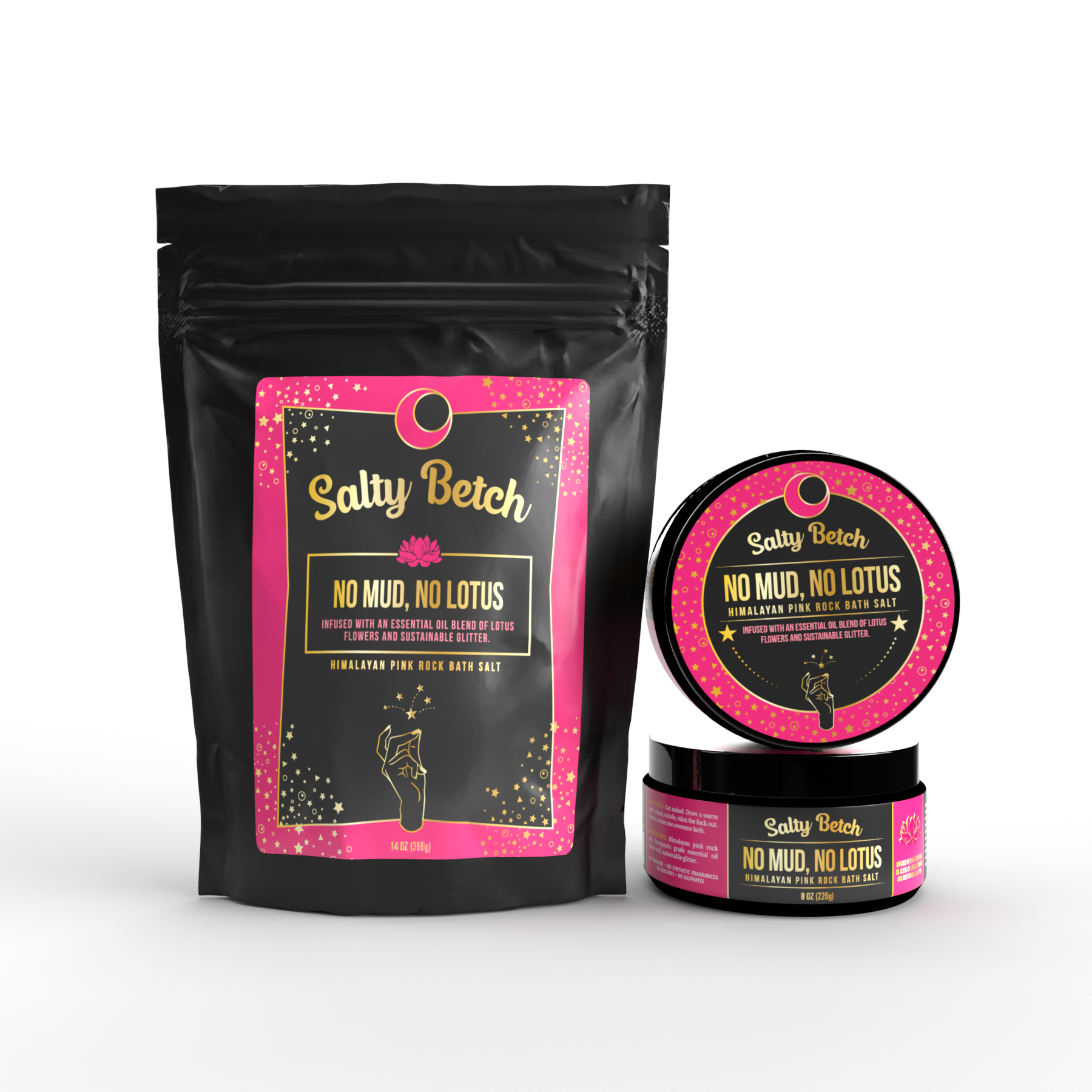
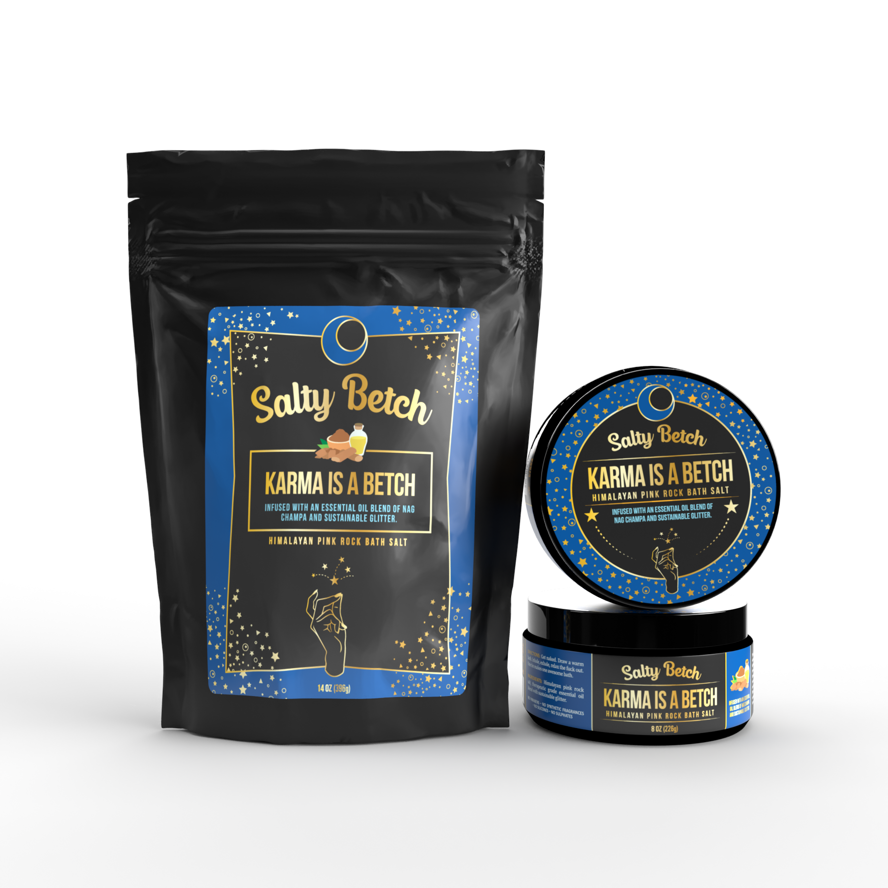
Salty Betch
OBJECTIVE: Design labels for a line of bath salts that have a sassy flare. Client mentioned wanting the labels to be influenced by “gold and alchemy—almost Bollywood Tarot or Eastern wellness funk” feel.
All labels are designed with gold lettering and accents. As time went on throughout with revisions to layouts, the packaging became more alchemy like and less tarot card like originally envisioned by the client. The client wanted to have snapping fingers on the packaging as they felt it encompassed their brand well.